Archives

My Meal Ui

Women Works About Me Contact Be in


My Meal Ui

App Design

BEE Design & Flower Shop

Women Works About Me Contact Be in


BEE Design & Flower Shop

CORPORATE IDENTITY


Bee Design and Flower Shop is a brand that develops unusual flower and product designs.

Branding, naming, mottos, web design, photo shoots and interior design ideaswere made within the scope of the design.

BEE is inspired by the bee, one of the most hard-working creatures in nature. Apart from this, the factthat BEE works with flowers like bees do, played an important role in determining the name of the brand.

Black, white, yellow and gray are used as the main colors of the brand. The reason why white and gray are used is to make brand designs look bright and minimalistic. The main reason for using the yellow color is to refer to the bee.

The bee in the BEE logo is characterized in a futuristic and minimalistic way. One of the sans serif font family, Effra was designated as the corporate font of the brand and used in its logo. The font was chosen because it is clean, simple and stylish.

In the mottos, the characteristics of the bee are emphasized by combining be and bee.A bright but rustic atmosphere has always been given in photo shoots.

Jointern

Women Works About Me Contact Be in


Jointern

BRANDING


Jointern is a platform that enables students to find internship programs and it helps companies find the most suitable interns.

University communications and posters were made for the events to be held to gather brands and universities under the same roof.Mottos such as Join Life, Join Career and Join Evaluation were created based on the name Jointern.While trying to support career development with these mottos, we also wanted to draw attention to the word ‘join’.

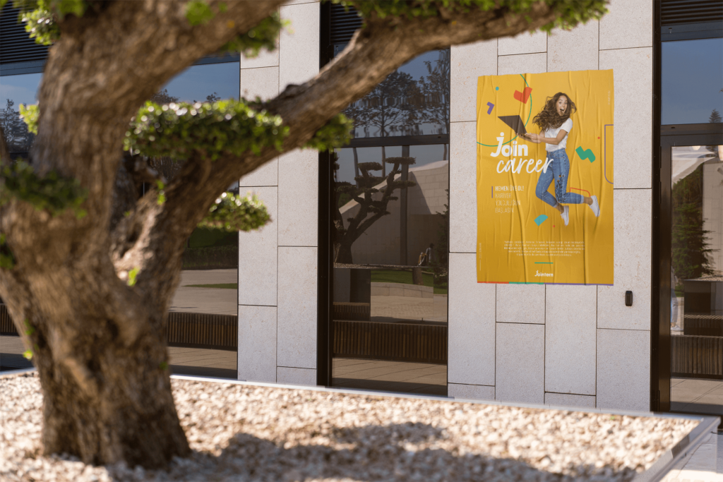
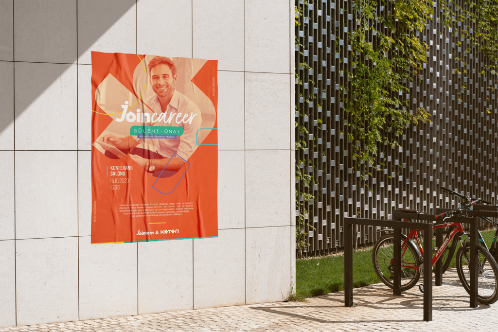
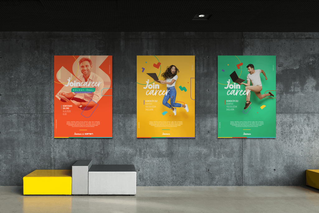
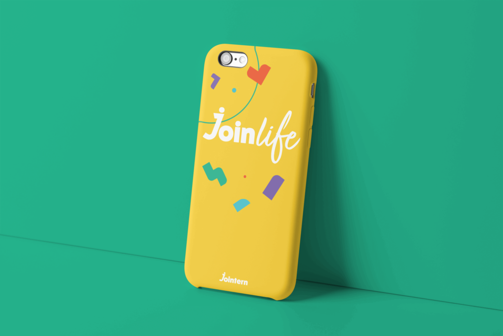
Based on tangrams, a special icon work was made for the jointern. Combining tangram pieces and developingdifferent shapes was associated with career steps. These icons were used in different forms in all designs.In the use of icons, vivid colors were preferred considering the youth; orange, blue, yellow, green and purplecolors were used.These colors were used in the entire visual language of the brand.

While the posters were designed in this direction by adopting a fun and active language in the communicationlanguage made to the students, the communication language for the brand conferences and studies was prepared in a more serious and institutional way.

Products that can be used by university students were designed; such as wristbands, sweatshirts, cloth bags, pins and phone case.

Student clubs such as join engineering and join advertisement were created under the join term,aiming for students to communicate among themselves and create a community. Icons and stickers related to these clubs were studied.

Drink Water Ui

Women Works About Me Contact Be in


Drink Water Ui

App Design

Koton

Women Works About Me Contact Be in


KOTON

INTERNAL COMMUNICATION

In Koton social media internal communication, the design language was createdbased on the 5 main colors that make up the brand’s values.

Design elements were created based on the thrush in the Koton logo.

The designs are supported with colorful graphics, taking into account these elements, with white color being the foreground.

Content describing motivation, newly opened store celebrations, tbt, events for employees, and career journeys of employees was prepared.


Subaru

Women Works About Me Contact Be in


Subaru

PRINT ADS.


Designs suitable for print ads such as advertisements, posters, brochures and billboards were made for Subaru.

A clean language was used in the designs. Dark blue, blue, gray and white were chosen for the designs in accordance with the colors of the company.

HR Panda

Women Works About Me Contact Be in


HR Panda

CORPORATE IDENTITY

HR panda is a human resources firm

In order to draw attention to the fact that the panda is a human resources character, the inscription HR is placed on its eyes.

The company requested the panda colors to be yellow and black. Gray and white colors were added to accompany them.

It was characterized for different occasions by making iconic additions to the panda like birthdays, celebrations and Valentine’s day. T-shirts, cups, posters and pin works were done.

A badge work has been done using the Panda footprint.

BEE Typography

Women Works About Me Contact Be in


BEE Design & Flower Shop Typography

TYPOGRAPHY


Product designs were made so that they would make people feel special and create a smile on their faces.

The most important feature of this design is the humorous naming. Typography studies were done by following the general corporate line of Bee. Gift alternatives were created by using these statements in different products. Cloth bags and gift cards are examples of these.

Olimpos

Women Works About Me Contact Be in


Olimpos

LOGO & PACKAGING DESIGN


Olimpos, which is about to enter the market, is a snack with a very high protein rate,whose target audience is bodybuilders. For this reason, it will only be sold in gym.

It takes its name from the Olympus mountain, which is the home of Greek gods in mythology. Since the productname is associated with Greek mythology, a modernized version of greek motifs is used in its logo.

The main colors of the brand are red to clearly emphasize energy and power, and white to emphasize health and lightness.

Apart from the logo of the Olimpos product, packaging and gym posters were designed. In the packaging design, because the target audience is bodybuilders and a fitness enthusiasts, a sporty look is added to the packageby using a lightning bolt, which is the symbol of energy.

Sinpas

Women Works About Me Contact Be in


Sinpas

INTERNAL COMMUNICATION


Internal communication mails for Sinpas company and post designs for career social media accounts were designed.

Corporate and entertaining content was prepared in accordance with the Sinpas corporate culture. Since the works are used in internal communication and career pages, the lines of Sinpas holding were taken as basis in the designs andsuitable colors for the company were used. In addition, a clean language was used in the designs.

Job ad posts, content for employee motivation, company achievements and special day videos were designed for social media accounts.

In internal communication, promotions, seniority, vacancies, special day celebrationsand other mails were designed.