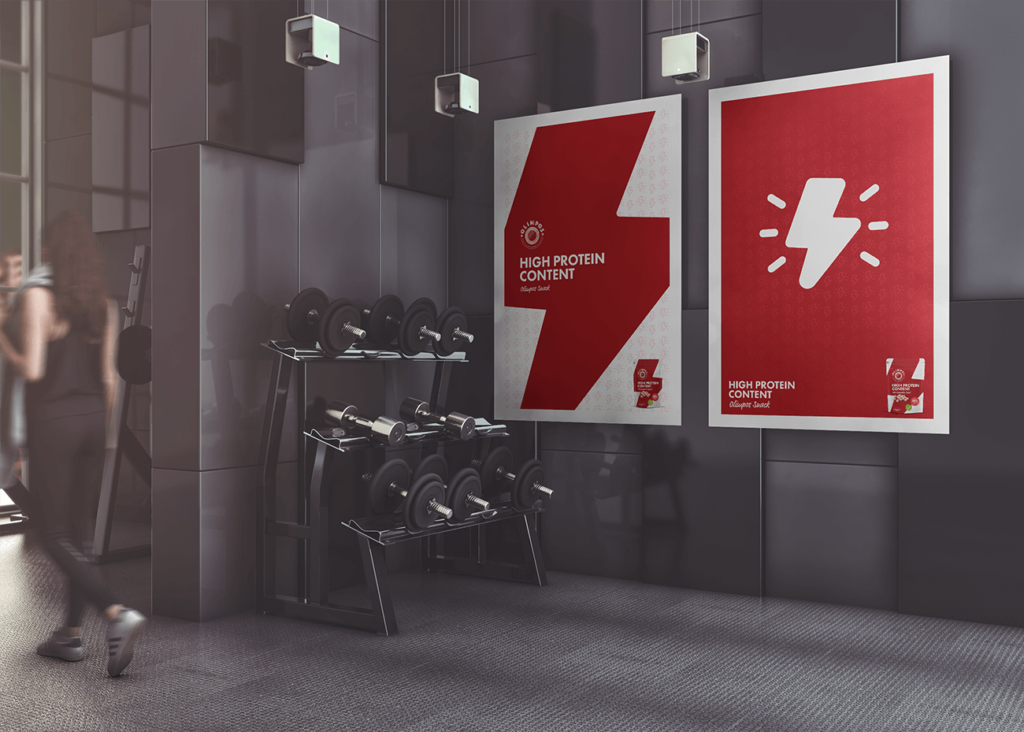
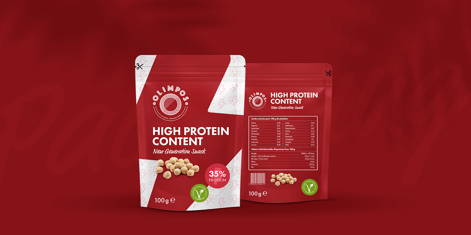
Olimpos, which is about to enter the market, is a snack with a very high protein rate,whose target audience is bodybuilders. For this reason, it will only be sold in gym.
It takes its name from the Olympus mountain, which is the home of Greek gods in mythology. Since the productname is associated with Greek mythology, a modernized version of greek motifs is used in its logo.
The main colors of the brand are red to clearly emphasize energy and power, and white to emphasize health and lightness.
Apart from the logo of the Olimpos product, packaging and gym posters were designed. In the packaging design, because the target audience is bodybuilders and a fitness enthusiasts, a sporty look is added to the packageby using a lightning bolt, which is the symbol of energy.