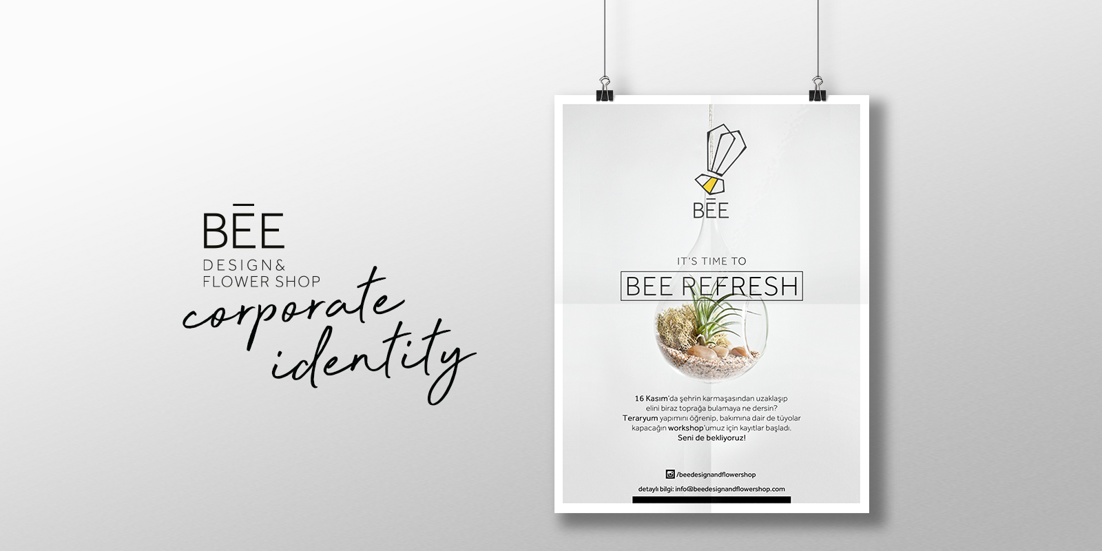
Bee Design and Flower Shop is a brand that develops unusual flower and product designs.
Branding, naming, mottos, web design, photo shoots and interior design ideaswere made within the scope of the design.
BEE is inspired by the bee, one of the most hard-working creatures in nature. Apart from this, the factthat BEE works with flowers like bees do, played an important role in determining the name of the brand.
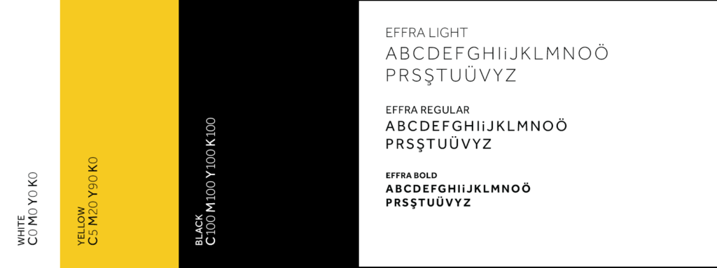
Black, white, yellow and gray are used as the main colors of the brand. The reason why white and gray are used is to make brand designs look bright and minimalistic. The main reason for using the yellow color is to refer to the bee.
The bee in the BEE logo is characterized in a futuristic and minimalistic way. One of the sans serif font family, Effra was designated as the corporate font of the brand and used in its logo. The font was chosen because it is clean, simple and stylish.
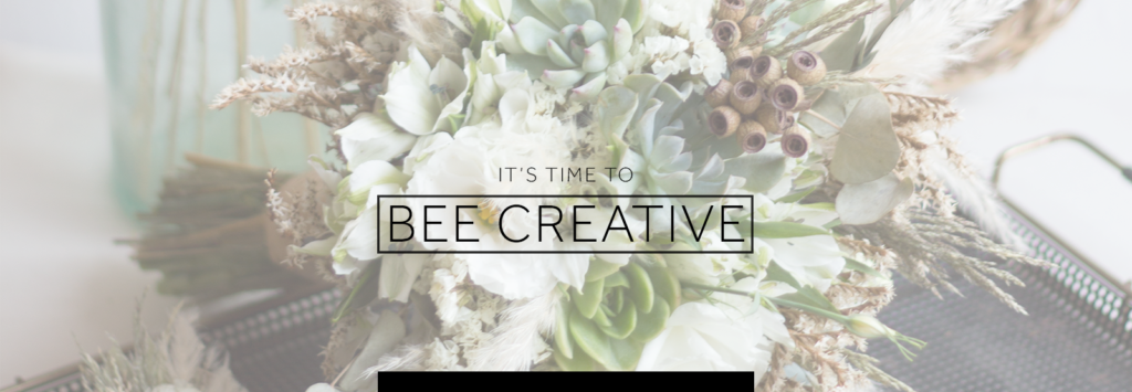
In the mottos, the characteristics of the bee are emphasized by combining be and bee.A bright but rustic atmosphere has always been given in photo shoots.