


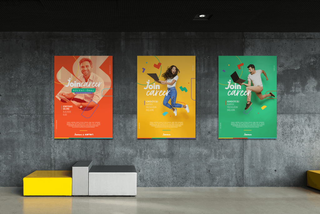
Based on tangrams, a special icon work was made for the jointern. Combining tangram pieces and developingdifferent shapes was associated with career steps. These icons were used in different forms in all designs.In the use of icons, vivid colors were preferred considering the youth; orange, blue, yellow, green and purplecolors were used.These colors were used in the entire visual language of the brand.

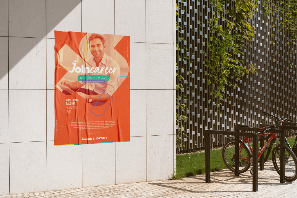
While the posters were designed in this direction by adopting a fun and active language in the communicationlanguage made to the students, the communication language for the brand conferences and studies was prepared in a more serious and institutional way.


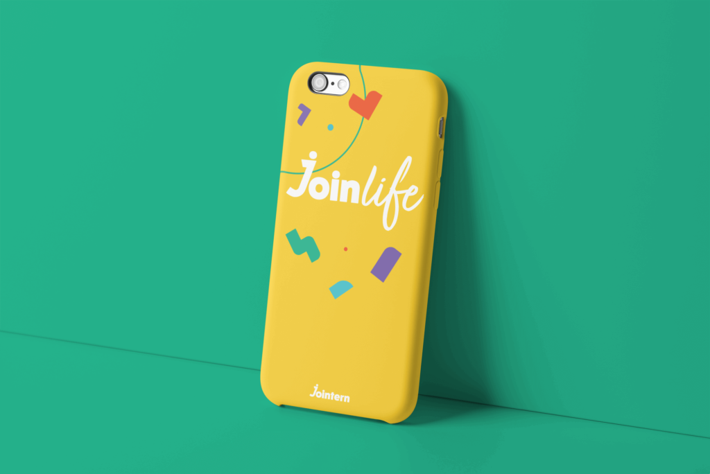
Products that can be used by university students were designed; such as wristbands, sweatshirts, cloth bags, pins and phone case.


Student clubs such as join engineering and join advertisement were created under the join term,aiming for students to communicate among themselves and create a community. Icons and stickers related to these clubs were studied.
